Choice Slasher Posters From 1978 (Halloween)-1984 (ANOES)
Posters help sell a movie. They catch the public’s eye and, if you’re the right target for what they’re selling, they should encourage you to buy that ticket. Though the art is somewhat dead today (too many Photoshopped pictures of teen stars, not enough design), there are still plenty of examples from the golden age of slasher flicks (admittedly filtered through nostalgia) that successfully hint at the suspense, shocks and depravity the flicks they’re huckstering promise to contain. Though not all of the flicks represented are worth watching, there’s something about their posters that I respond to. Take a look, and add a comment about your favourites (or the ones you’d knock off the list).

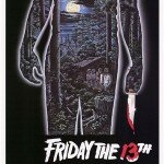
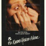
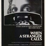
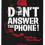



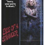
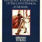
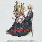
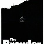
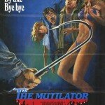
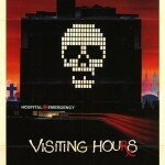
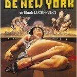
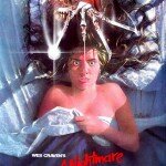

Poster art seems to go in cycles of inventiveness. A lot of the stuff from the 1920s to 1930s are brilliant modernist designs.
Then they get boring and photographic in the 4Os. Hit a new peak in the 1950s to 70s. The 8Os ones have a wonderful lurid paperback sleaze about them that tails of by the end of the decade. Curtains had a great poster, House on Sorority Row’s is so tasteless it’s fantastic and American Gothic’s poster gives the film it’s substance.
90s – 00s and it is, as you say, Photo-shop stuff. I don’t think it’s nostalgia that makes the older ones look interesting though. I think it’s just that a PR department professional blandness and fear of looking tacky has come to dominate the way films are marketed. Well, that and the fact any Herbert can work photoshop and get something acceptable out of it.
zisifehiqyn…
N’Dea Davenport …
I love retro posters. Nowadays they’re not creative, just lazy.
These are great. The Prowler poster is amazing. Obviously I’d seen the graphic on this site, but didn’t know what it was from.